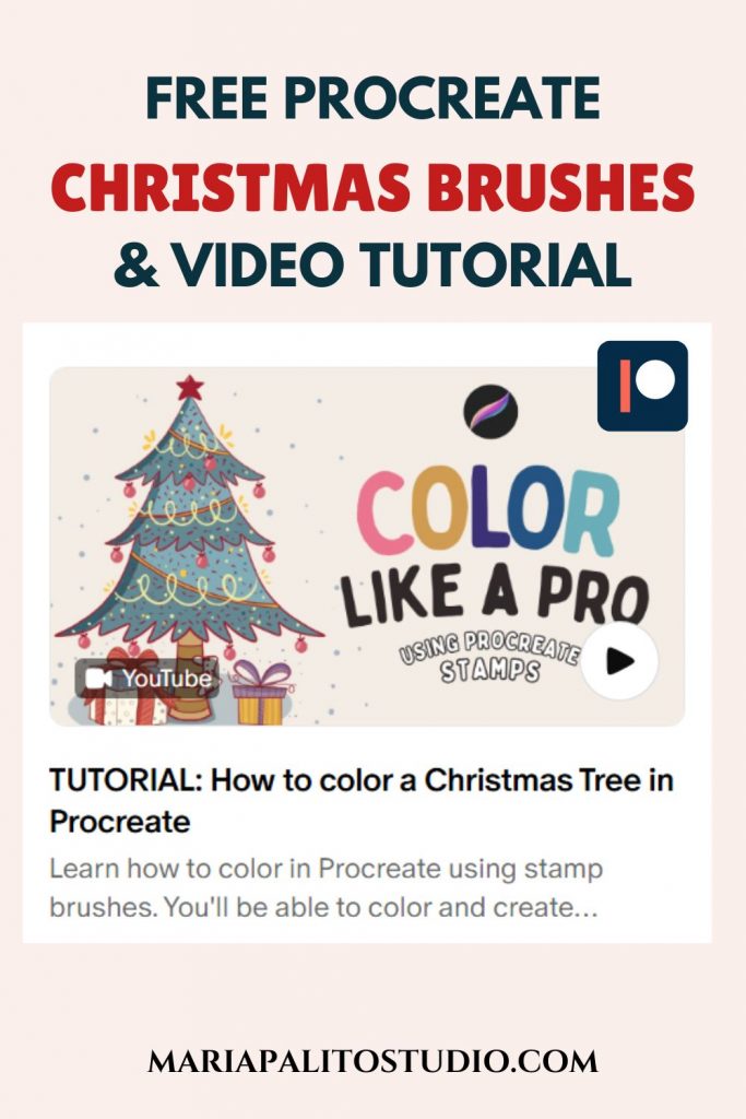
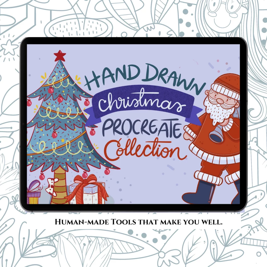
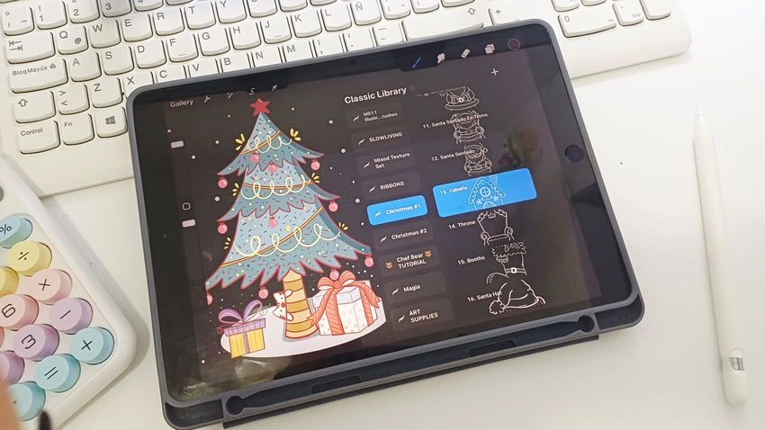
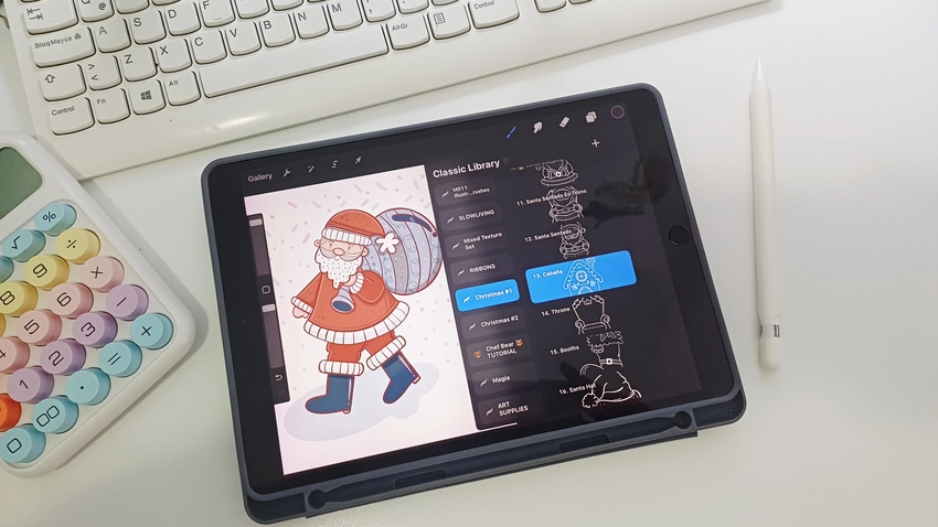
In this video, I’ll be sharing my coloring techniques using one of the hand-drawn stamp brushes I created for my new Christmas Procreate Brush Set. This time, I’ll be using a Christmas tree from my new Hand-Drawn Christmas Procreate Stamp Set, now available in my shop.
I’m excited to share a new tutorial with you! Today we’ll learn how to color in Procreate using stamp brushes so you can create beautiful crafts and illustrations with ease. In this video, I’m coloring a hand-drawn Christmas tree from my new Hand-Drawn Christmas Procreate Stamp Set, now available in my shop.
This tutorial is totally beginner-friendly, perfect if you’re just starting your digital art journey.
If you’re not using Procreate, don’t worry—many of the tips and creative tricks work beautifully in other apps too.
If you want to follow along the video. Join my Patron
I’ve attached everything you need so you can follow along easily, plus you get instant access to:
– 8 Free Christmas Procreate Stamps
– Christmas Color Palette
- Unlock my full library of step-by-step art tutorials. Join my Patreon for new lessons every month.
I can’t wait to share with you on Patreon!
Enjoy,
MariaPalito ♥
These brushes belong Hand-Drawn Procreate Stamp Brush Collection
Cozy Christmas Procreate Brush Set – 44 Hand-Drawn Procreate Brushes Stamps, No AI. Create festive cards, stickers, and cozy illustrations with authentic, hand-drawn brushes made by a real artist. Perfect for beginners or pros who love warm, nostalgic Christmas art.
ORDER NOW HERE!
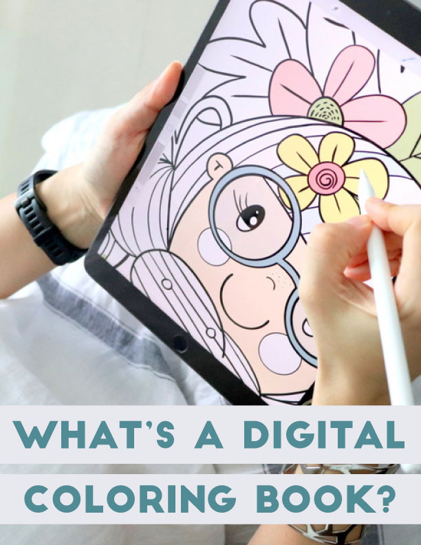
There’s something special about those chilly moments when you’re wearing cozy long socks and just want a little time to relax. You sit on the couch, open your iPad, and start coloring one of these illustrations — creating beautiful designs for your small business or heartfelt gifts for the people you love.
This set includes 44 Christmas Procreate stamp brushes that let you easily stamp images onto your canvas and then color them however you like — adding your own personal touches and details. It’s perfect for relaxing, getting creative, and filling your iPad with the cozy and joyful spirit of Christmas.
I’m so excited to share my latest Procreate brush set with you! It’s probably the last one I’ll release this year, and I’m thrilled that this launch comes just in time for Christmas. This is the perfect season to start creating gifts, designing products, and sharing your art with the world. This little set can help you make beautiful illustrations—with just a bit of my help.
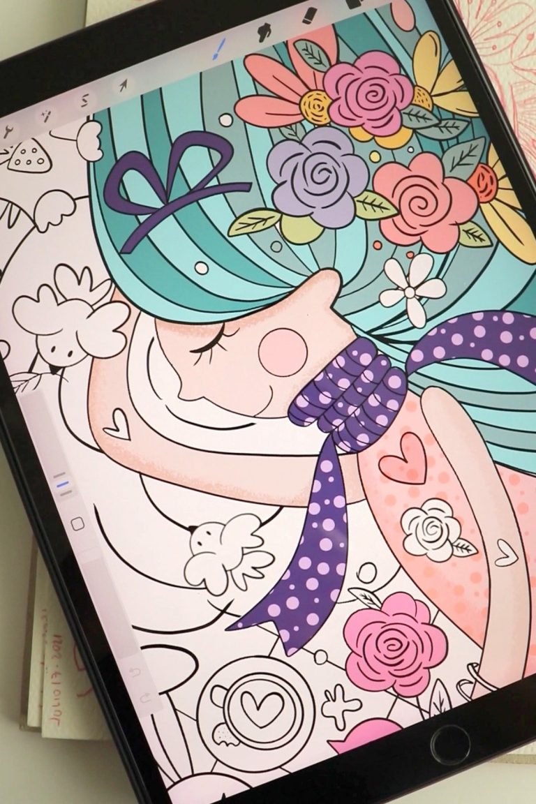
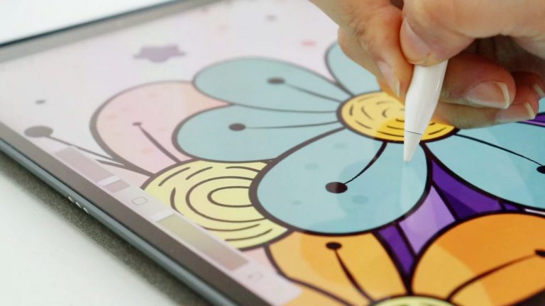
Here are a few coloring tips. I like to use a contrasting color for the outline—but not black. Sometimes I use blue, purple, or red. These tones keep a nice contrast while maintaining harmony in the linework. Also, I never paint directly on the lineart or stamp layer. I prefer to keep it on a separate layer so I can adjust it later if needed. All the coloring goes underneath on other layers. I also lock the main lineart layer to protect it and avoid accidental changes while coloring.
Another thing I like to do is use similar shades to the ones I’ve already applied, but slightly darker or lighter. You can do this by moving around the color square—left or right, up or down—to adjust the tone without leaving the same range. This helps maintain color harmony throughout the artwork.


I hope you enjoy this video and learn how to color the way I love to do it, so you can practice with your own illustrations too. Thank you so much for watching! Don’t forget to subscribe to my YouTube channel and join my mailing list to get all the latest updates straight to your inbox. See you in the next video!